Brand Identity & Visual Design
Alongside my work architecting enterprise SaaS platforms and design systems, visual design and brand storytelling remain foundational to my craft. This collection highlights graphic design work spanning community festival brand identities, print-ready style guides, photo compositing, and promotional social media campaigns.
Bainbridge Island Film Festival (BIFF)
Brand Identity, Logo System & Style Guide
Created the visual identity and comprehensive logo usage guide for the Bainbridge Island Film Festival, capturing the creative spirit and Pacific Northwest coastal environment of the island community.
Visual Design Highlights
- Iconic Logo Architecture: Designed three modular mark configurations—an iconic primary Stacked Logo, a bold standalone BIFF Acronym Mark, and a horizontal Text Logo—ensuring visual balance across theatre marquees, festival passes, posters, and digital headers.
- Organic Coastal-to-Forest Palette: Crafted a 7-color organic banded motif inside the geometric letterforms that transitions from warm sunset terracottas and golds (
#DD532E,#FC9F03,#FCC22B) into deep island evergreens (#A2BE6F,#76B286,#65857E), complete with calibrated RGB, CMYK, and HEX production specifications. - One-Color & Reverse Print Versatility: Engineered high-contrast monochrome black and knockout white variations so the identity retains crisp legibility on screen-printed merchandise, sponsor playbills, and dark cinema projection screens.
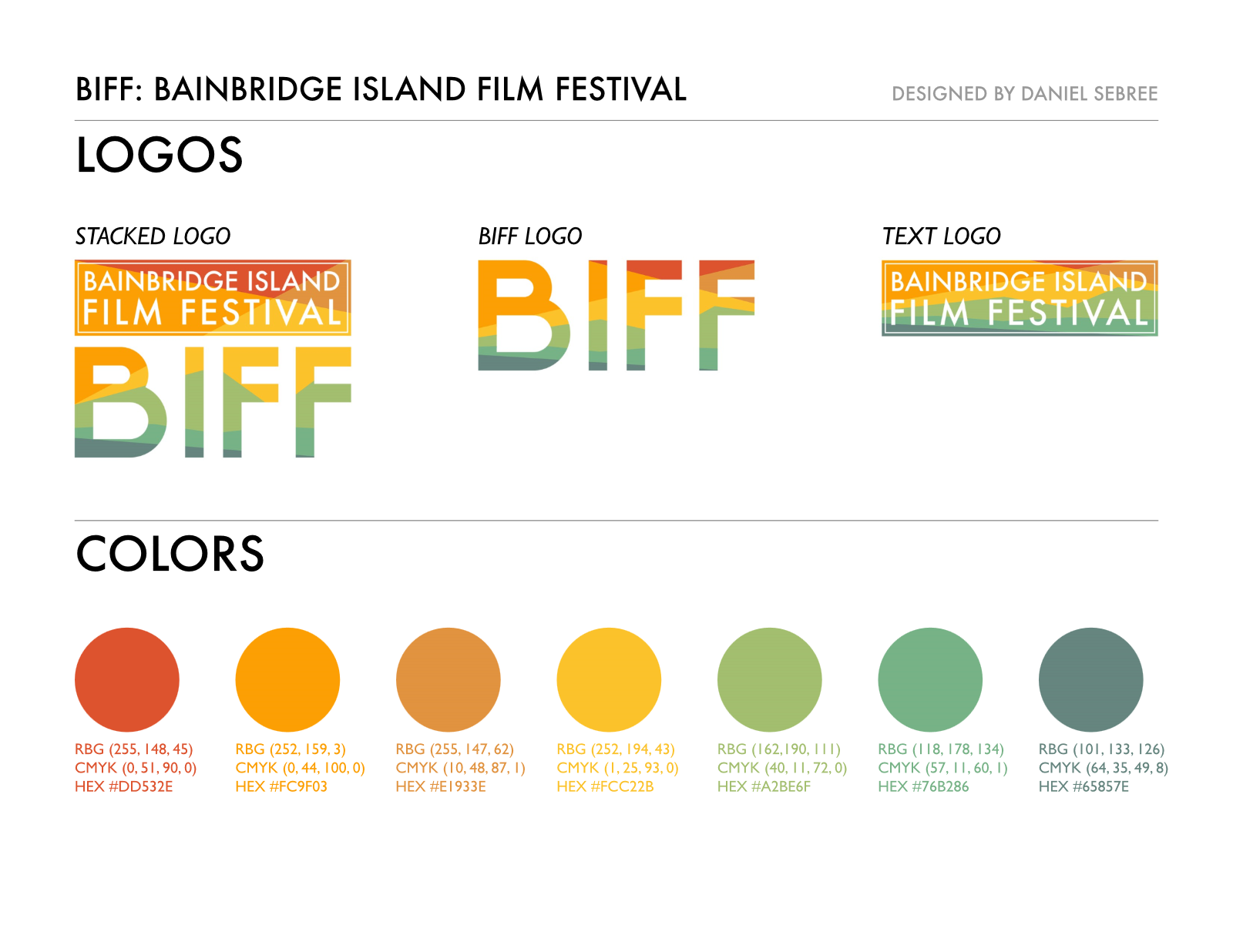
BIFF Iconic Logo Suite & Color Specs: Stacked, acronym, and horizontal text logos paired with the 7-stop sunset-to-evergreen color system defined across RGB, CMYK, and HEX.
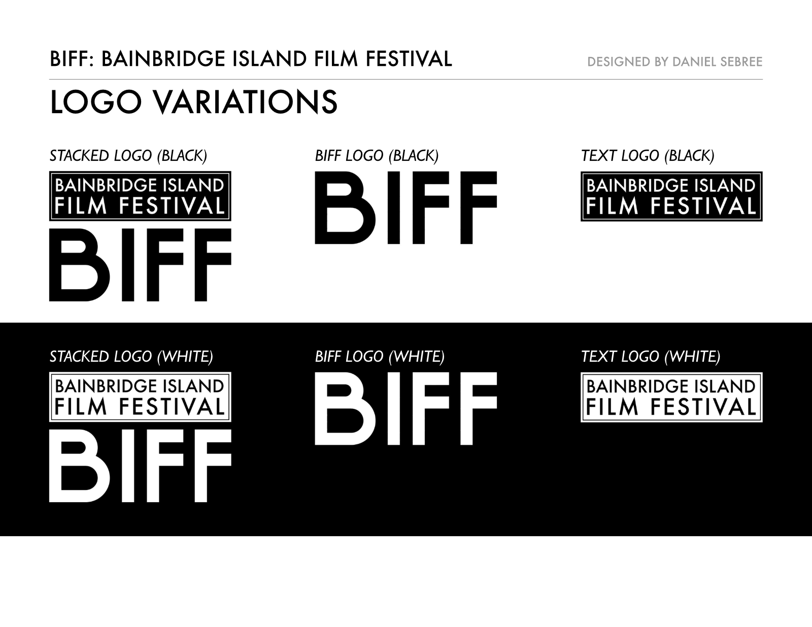
Monochrome & Reverse Logo Variations: Single-color black and knockout white logo iterations engineered for high-contrast print, apparel, and dark cinema backdrops.
Bainbridge Book Festival (BBF)
Visual Identity, Iconography & Brand Guidelines
Developed the brand identity and visual system for the local literary festival, uniting classic editorial warmth with symbolic Pacific Northwest imagery.
Visual Design Highlights
- Dual-Metaphor Geometric Mark: Constructed an iconic emblem that merges the pages of an open book on the left with the segmented veins of a leaf on the right—tying literary discovery directly to the natural character of Bainbridge Island.
- Editorial Typography & Logo Pairing: Paired the iconic emblem with Rockwell Regular, a geometric slab serif that lends literary authority and approachability, structured in both vertical stacked and horizontal side-by-side logo configurations.
- Autumnal Literary Palette & Dark-Mode Adaptations: Defined a rich 7-color palette spanning crimson (
#9c2231), burnt orange (#c66b07), ochre (#c69337), sage (#687463), slate blue (#405377), and plum (#5f223e), alongside monochrome and dark-surface variations with negative-space leaf veining.
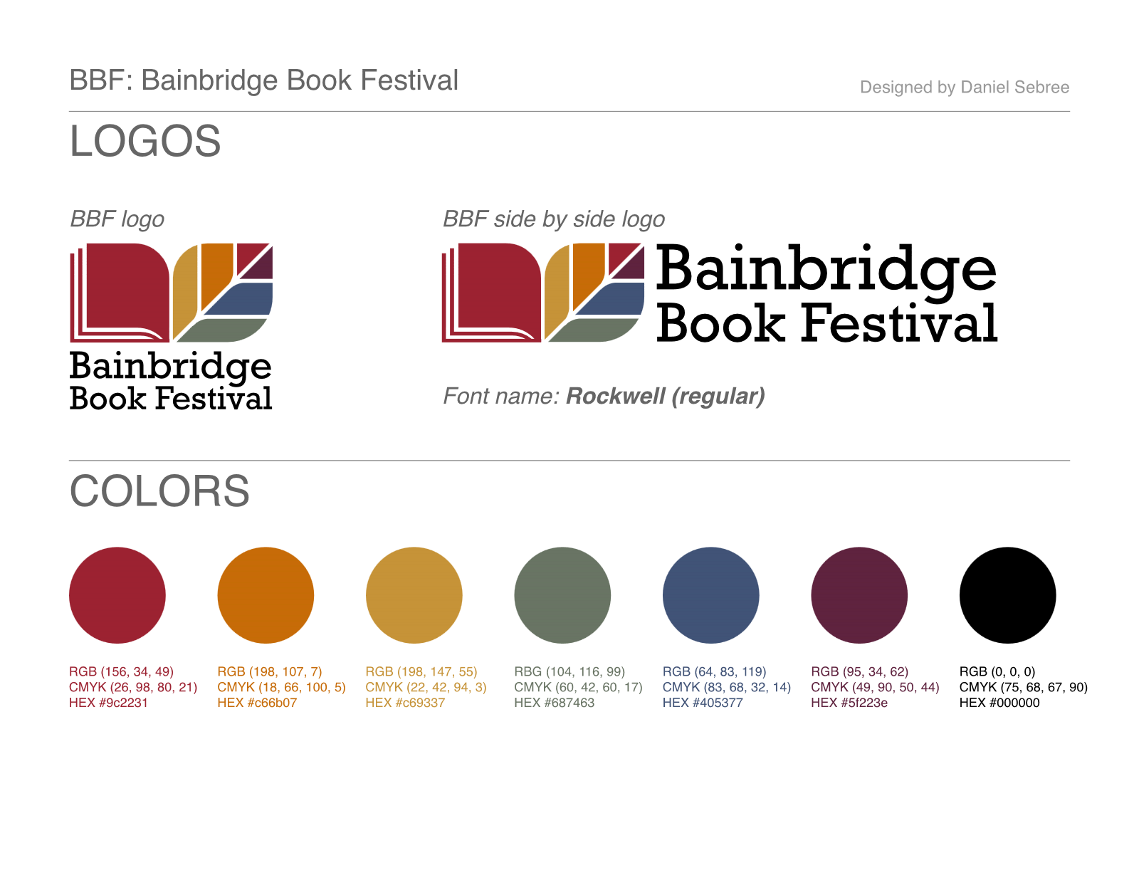
BBF Primary Identity & Color System: Iconic open-book/leaf emblem in stacked and side-by-side logo configurations set in Rockwell Regular, accompanied by full print and digital color specifications.
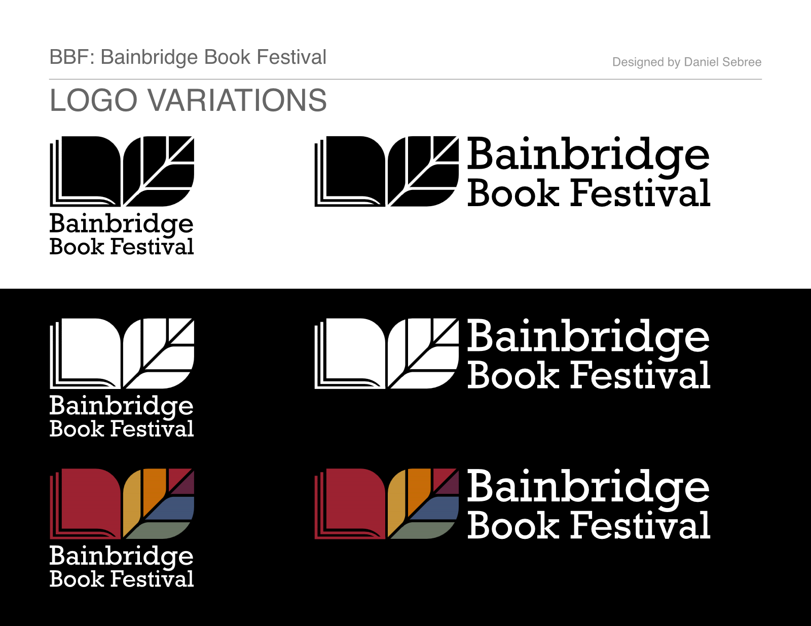
Light, Dark & Full-Color Reversals: High-contrast black, knockout white, and dark-background full-color logo treatments preserving crisp leaf-vein and page-edge negative space.
Ezell's Famous Chicken
Social Media Graphics, Photo Compositing & Motion Design
Designed a series of engaging graphics and animated posts for Seattle icon Ezell's Famous Chicken's social media channels—including daily updates announcing where the Ezell's Express food truck would be parked.
Visual Design Highlights
- Playful Photo Compositing & Illustration: Blended product photography with custom vector illustration and dynamic lighting for social media posts—such as an illustrated chicken claw gripping a coffee mug to announce the Ezell's Express food truck stop at Starbucks HQ in SODO Seattle, and the food truck bursting out of a golden radial swirl.
- Pop-Art Halftones & Custom Display Type: Explored vibrant posterized halftone patterns, duotone/tritone color contrasts, and dimensional arched typography to command attention and stop scrolls in busy social feeds.
- Looping Social Motion Graphics: Created animated GIF posts combining bold brand badges with looping photography to drive engagement and shares across social channels.
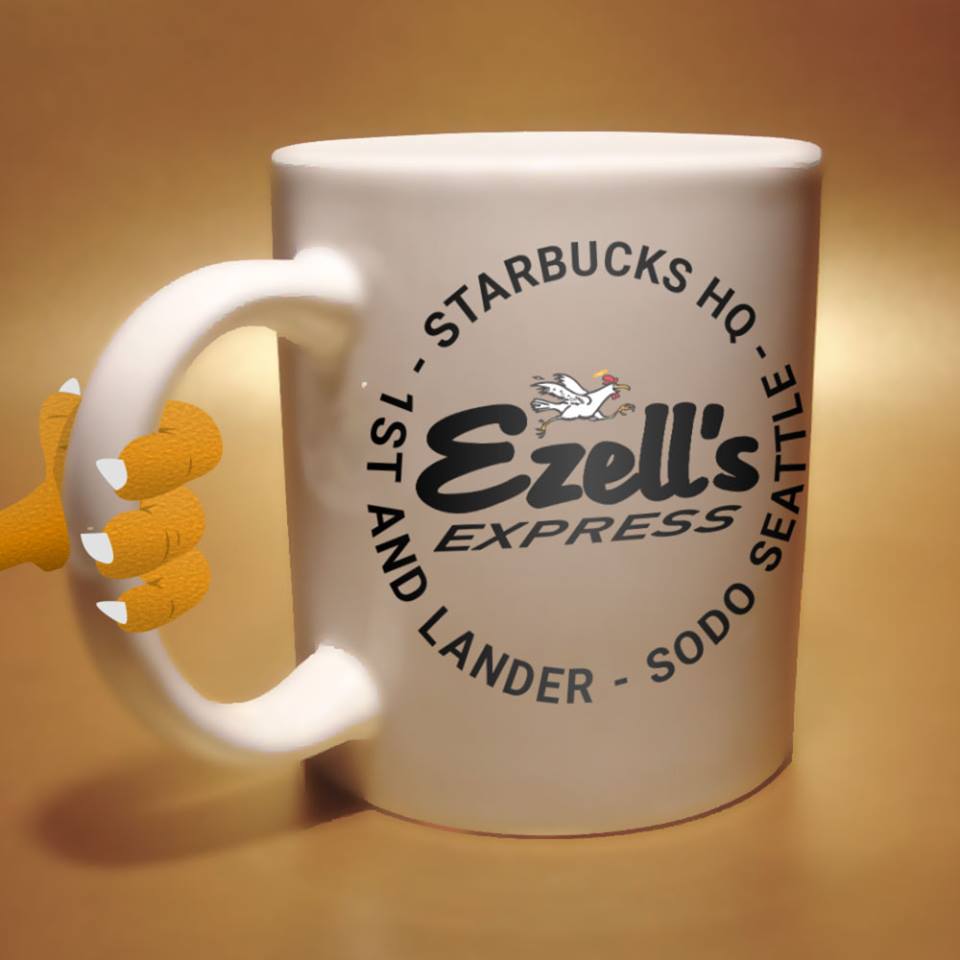
Food Truck Stop Announcement: Custom photo composite and vector illustration for social media announcing where the Ezell's Express food truck would be parked (Starbucks HQ at 1st & Lander, SODO Seattle).
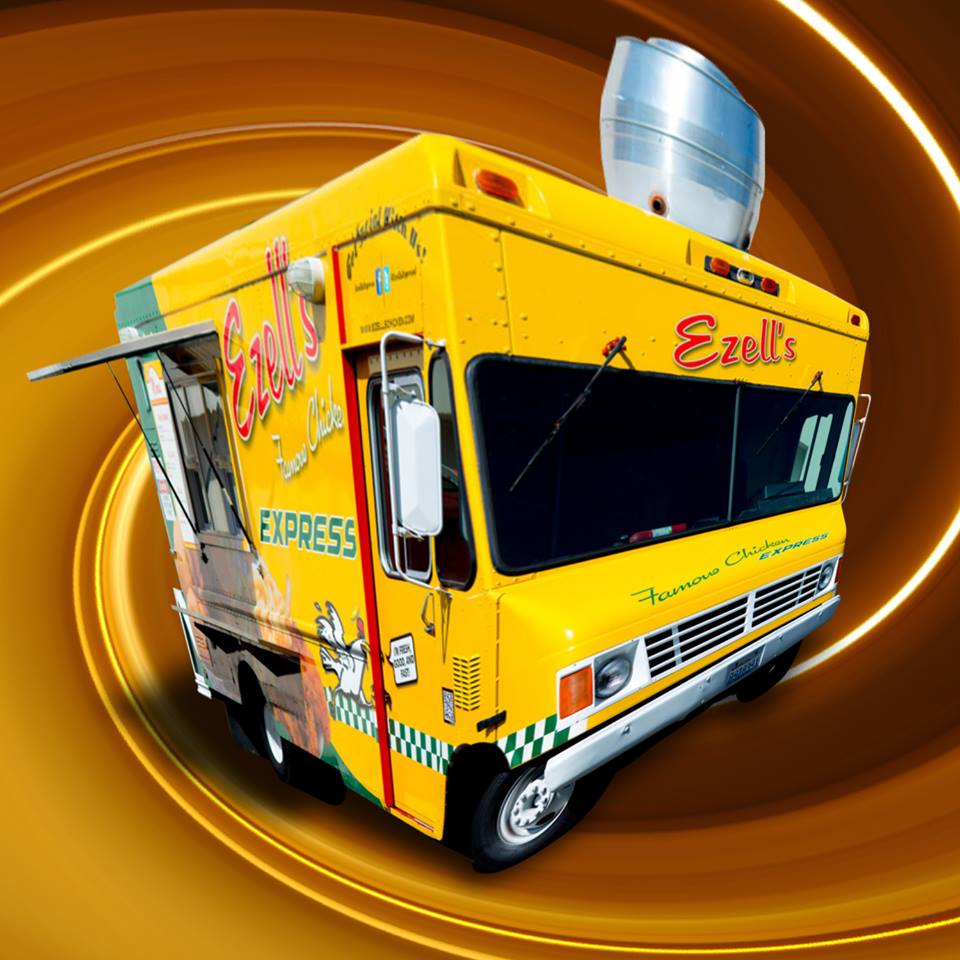
Ezell's Express Food Truck Spotlight: High-contrast cutout and perspective compositing set against a warm radial motion backdrop.
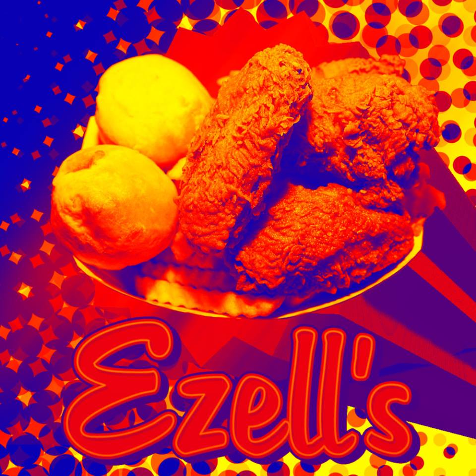
Pop-Art Halftone Treatment: Posterized tritone color study and comic-inspired halftone dot patterns highlighting Ezell's signature chicken and rolls.
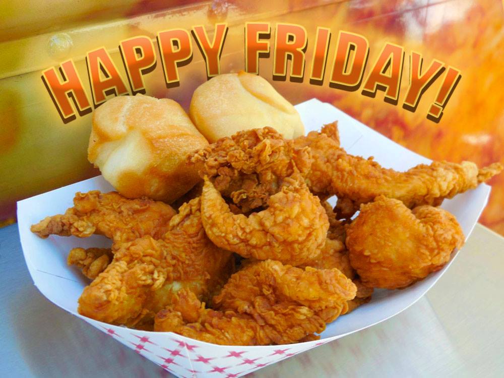
Weekly Engagement Graphic: Warm, appetizing close-up photography paired with custom arched, bevel-shaded display typography.
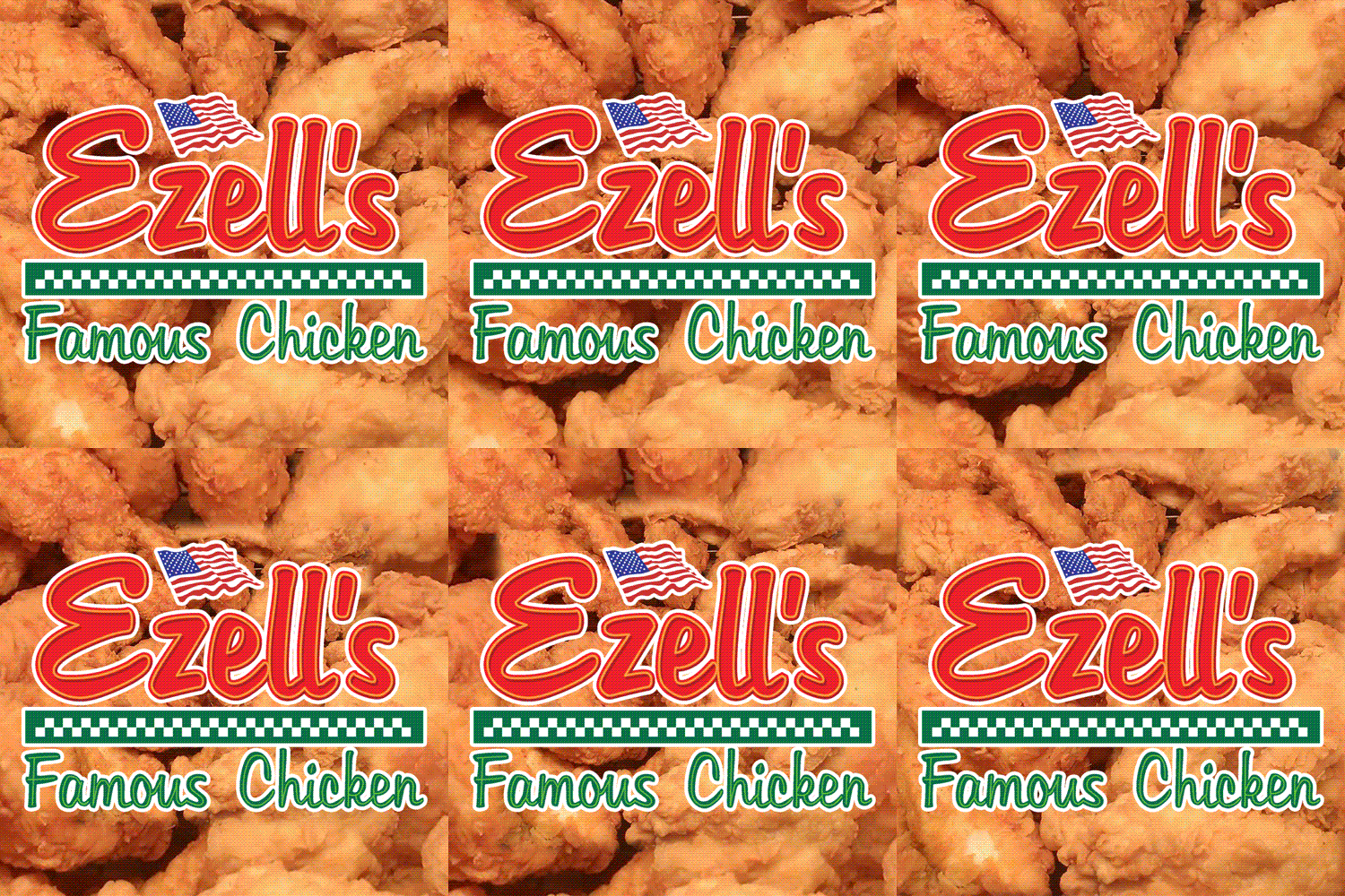
Animated Social GIF: Looping motion graphic pairing the classic Ezell's Famous Chicken checkerboard emblem with an endless backdrop of crispy tenders.